Knowledge
How to make great podcast artwork, that pops!
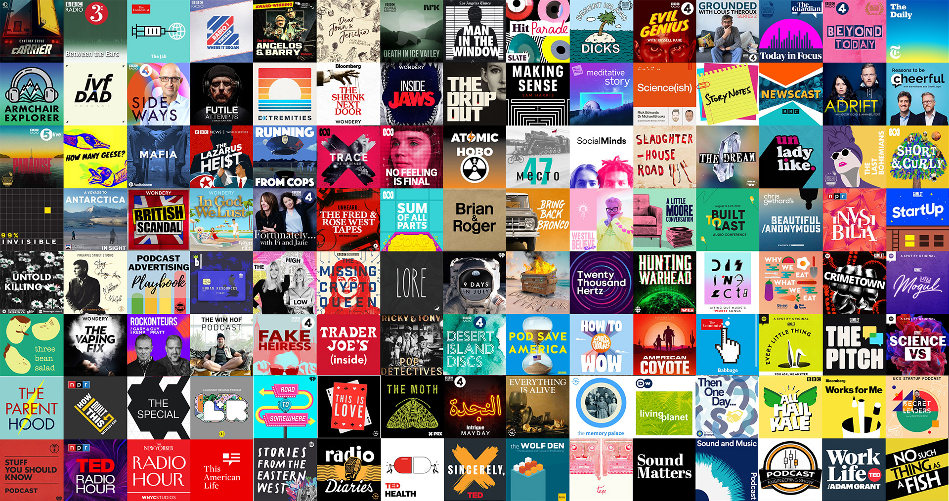
Think about the last podcast you discovered. You probably didn't hear it first. You saw it. That's the job your artwork does. It's the first conversation your podcast has, and it happens before a single word is spoken.
Your podcast artwork is like your book cover on the shelf (when we still had bookshops) or your album sleeve on display (when we still had record stores).
It should grab attention, stand out from the crowd, make your listener think 'hey that podcast is talking to me', it should pop!
For a lot of brands and podcasters alike, producing a podcast is a big investment in both time and money so when it comes to creating a visual presence it makes a lot of sense to get it right, it’s most likely the first engagement anybody will have with your podcast.
In this post we’ll go through the most important things you need to consider when it comes to your podcast’s artwork, or more accurately, it’s visual identity, whether you’re creating it yourself, or briefing a designer. We’ll also inspire you with examples of some of the best ones out there.
Who is your podcast for?
Your artwork is your calling card so think about the audience you want to attract (find out why that single listener is so important here). Your visual identity is often the first thing they will see in their podcast app, in a review, or as part of your clips shared via social media.
Before colour, before fonts, before anything, picture the one person you want to reach. What would make them stop? What quietly says "this one's worth my time"?
A cover that tries to appeal to everyone tends to land with no one. The sharper your sense of that single listener, the sharper everything that follows.
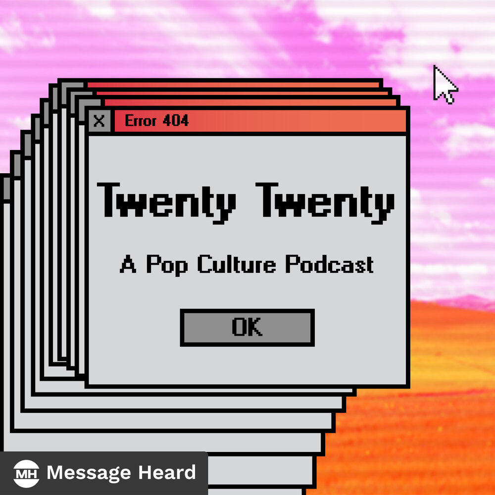
Think about what sort of imagery, art, words, fonts or graphics might grab their attention. Like this one, from Twenty Twenty: A Pop Culture Podcast from Message Heard. It’s a podcast about pop culture from 2000. The imagery taps into nostalgia and is bound to chime with their target audience.
What does your podcast artwork say about your podcast?
For this reason, try not to leave your artwork as an afterthought. When we’re working with brands, we’re having conversations during our podcast strategy sessions about what the podcast might ‘look like’ during our strategy sessions. Once you’ve nailed your format and you know who your audience is, what your podcast is all about, what stories you’re going to be telling and what your podcast stands for, you can use this knowledge to start getting creative.
Thinking outside the “square”
For years, podcast artwork meant one thing: a 3,000-pixel square. That square still matters. But it's no longer the whole job.
Apple and Spotify now treat video as core rather than a bonus and YouTube is the most popular place people go to listen to, and watch, podcasts.
That means thinking beyond the cover artwork to the 16:9 thumbnail that sells a video episode, the channel art, the clips, the on-screen branding and the social assets that will lead people to your podcast.
The brands winning attention in 2026 don't just design a cover. They design a complete visual identity.
But first…know the specs!
There’s a few fundamentals you need to get right, regardless of the creative. Apple has a set of requirements and best practices, which apply across the board.
Size and file type are the big ones to get right, Apple recommend:
- Size: Square, 3000 x 3000 pixels
- Resolution: 72 dpi
- File type: JPEG or PNG
- Colorspace: RGB
There’s more to check out in Apple’s online guide including a whole range of different image sizes to give your podcast the best change of showing up in Apple Podcasts.
The reason the size is so important is so that it scales well, your podcast artwork may be displayed as small as tiny square in a push notification, or full size on a large display. Which leads us to the other important factor….
Choose a design that scales
Whatever design you choose, make sure it looks as good and attention grabbing at the smallest size as it does at the largest size, that means:
- Avoiding small text
- Avoiding intricate fonts which could be hard to read, large or small.
- Avoiding the use of too many colours or overly-intricate designs
Luckily there’s a few good online tools to test out what your podcast artwork looks like at every conceivable size, like this one from OnlyPod.
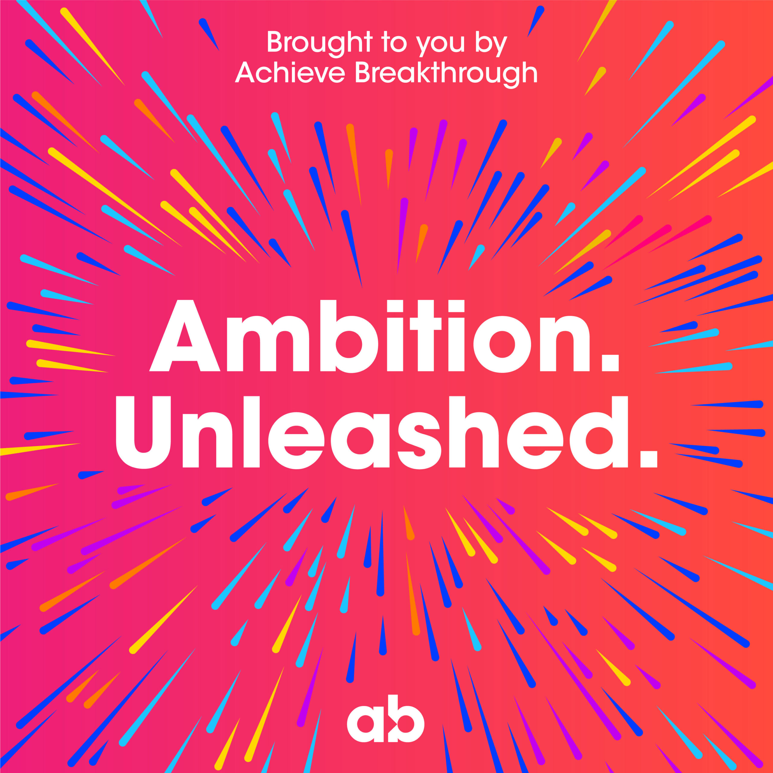
We took this simple approach for the podcast 'Ambition. Unleashed.' we made for Achieve Breakthrough. The brand already had a vivid colour palette so we lent on this to create a simple, eye-catching design, it even allowed us to create episodic versions that look great in Spotify.
Think about colour
Creative use of colour is a great way of making your podcast artwork stand out. However before you jump in with your favourite colour palette or your brand colours, it’s well worth doing some research into the colour trends of other similar podcasts.
Search your category on the platforms and see what everyone else is doing. If every show in your space is navy and gold, navy and gold is precisely how you disappear. The gap they've left you is your way in.
As with any colour decision though, don’t forget that some people may see colours differently, there's great online resources for making sure your podcast is accessible for all.
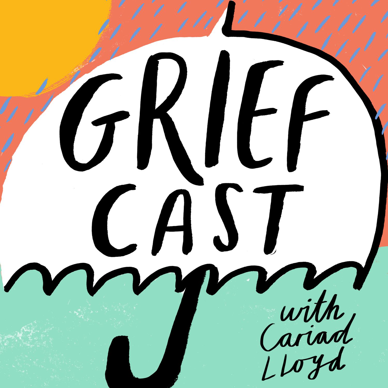
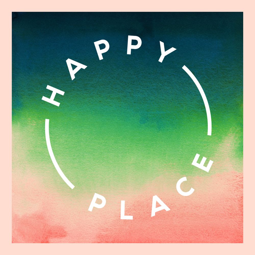

Vibrant colours from (top to bottom) Griefcast, Fearne Cotton's Happy Place, and Self Care Club from Stakhanov
Lastly, be mindful of dark mode options, and Spotify's black background, what might look great against a white background may not pop as much on a dark background.
People buy into people
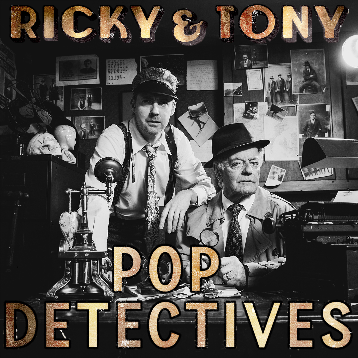
Generally, if the host or hosts are intrinsic to the podcast, it makes total sense for their face to be prominent on the artwork. A friendly face does something a logo never can. It earns trust before a word is spoken. Maybe your hosts are well known personalities (like Ricky & Tony: Pop Detectives we made with Universal Music - below). in that case it makes total sense for their face to be prominent on the artwork.
But what about other forms of photography in podcast artwork? The majority of podcasts tend to feature either faces or graphics, but you may have other reasons for wanting to feature photography as you artwork. For instance the podcast series ‘A Life More Wild’ that we made for the booking platform Canopy & Stars is all about the wild and connecting with nature, so for them having a photograph which captured the essence of being outdoors was really important.

Should podcast artwork feature company branding?
It’s a common question from brands and one which there’s no definitive answer. Unless there’s a really good argument for it, we’d always recommend that a podcast artwork isn’t just the company logo. Whilst it may align the content with the brand it doesn’t tell the listener anything about what to expect from the content and therefore give them a reason to listen.
Any podcast from a brand should be tapping in the needs of the audience and providing them with content that gives them value, and that they’d want to listen to regardless of whether it was published by a brand or not.
If your company logo can be incorporated into the design in a subtle way that feels in-keeping you might decide to include it (like Canopy & Stars have above) but remember the podcast itself should be doing a great job of brand association and your brand name will in most cases appear below your artwork as the publisher of the podcast anyway.
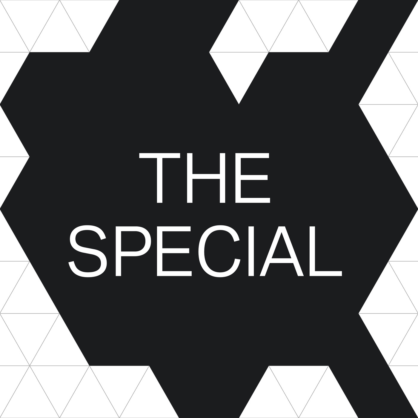
'The Special' (right) is a podcast from BMW that's chosen not to feature a logo, brand colours or name anywhere on the artwork
It’s not just about your podcast channel artwork
Now more than ever it’s important to think about how your podcast’s visual identity can flow across platforms and channels. As Apple and Spotify’s platforms have developed there’s more real estate for your podcast to occupy. If you’re planning on launching multiple shows, Apple Podcasts now allow channel artwork, a channel icon, logo and promotional banner - find out the size specs here.
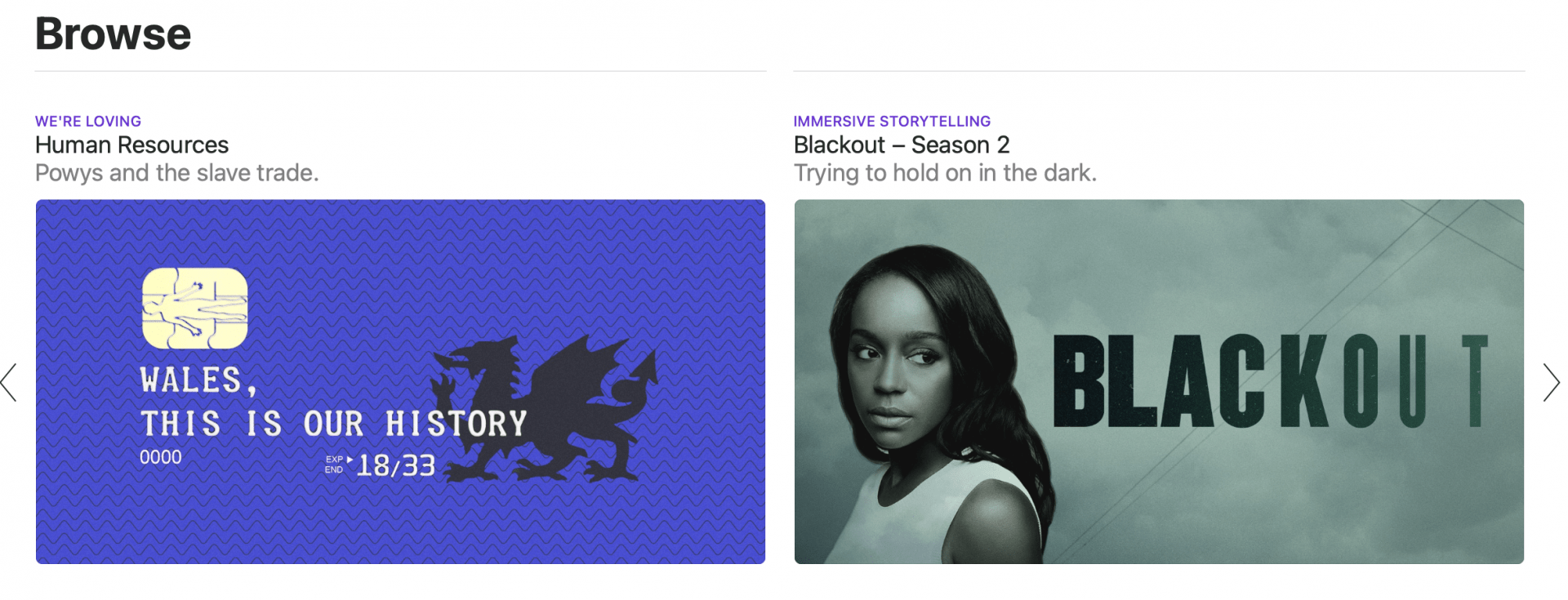
If you’re hoping to get featured in Apple or Spotify’s podcast recommendations, it pays to make sure your artwork is on point and you’ve given them great looking assets to feature so you pull in listeners.
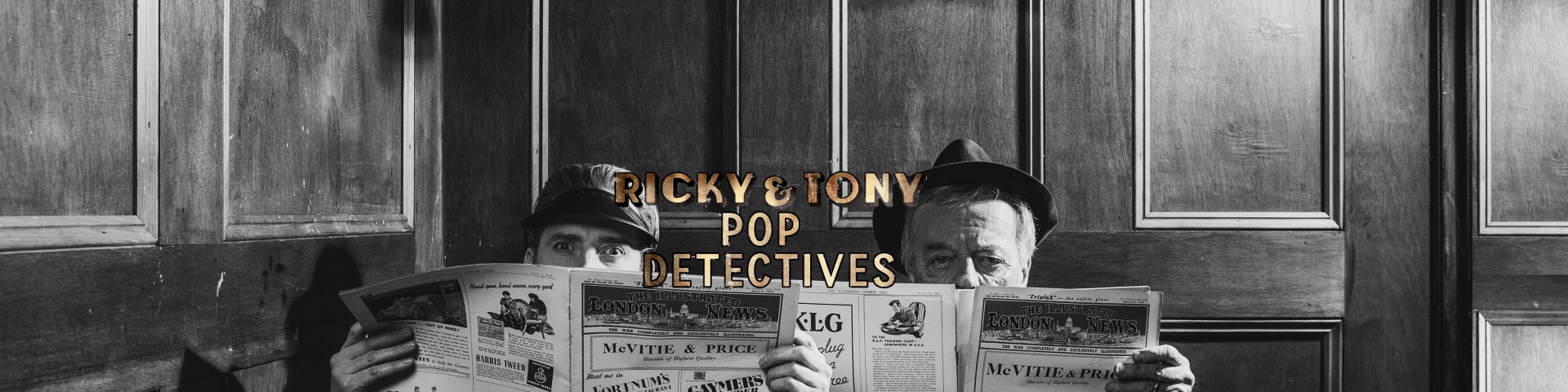
An alternative version of our series Pop Detectives for Universal Music was made into a banner for featuring on various platforms.
But what about other channels? You also want to think about adapting your artwork to give you attention grabbing assets for:
- Your podcast’s homepage
- Your social channels or promotional posts
- A YouTube Channel if you plan on creating video podcasts
Finally…Be creative
There is no exact science behind making great podcast artwork, it’s an opportunity to really have fun. For most of us who won’t ever get the chance of releasing an album or publishing a book, creating the artwork for your podcast is the equivalent of designing your sleeve art, or book cover, many of those are works of art in their own right.
As some final inspiration, here’s some of our favourite creative podcast artwork we’ve come across:
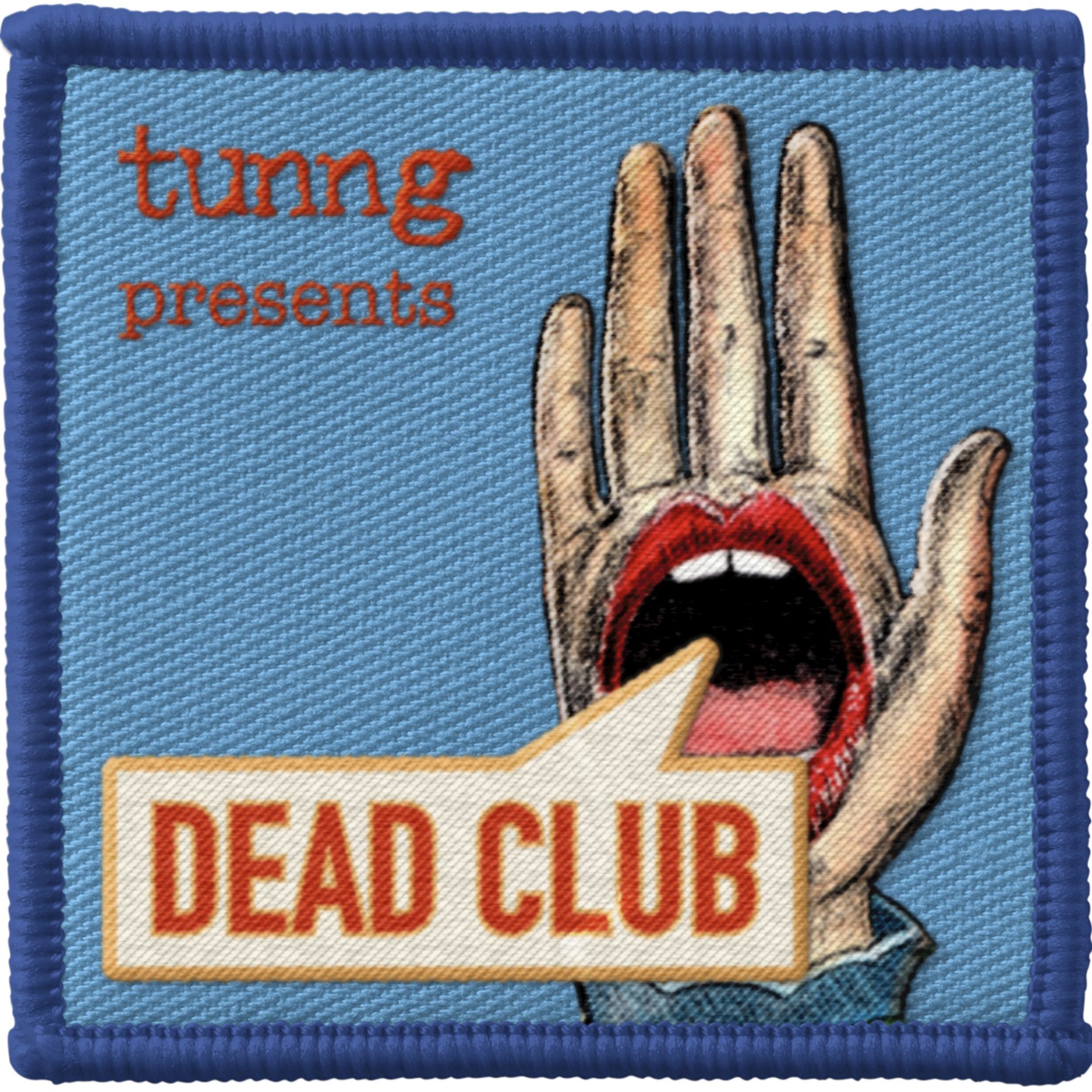

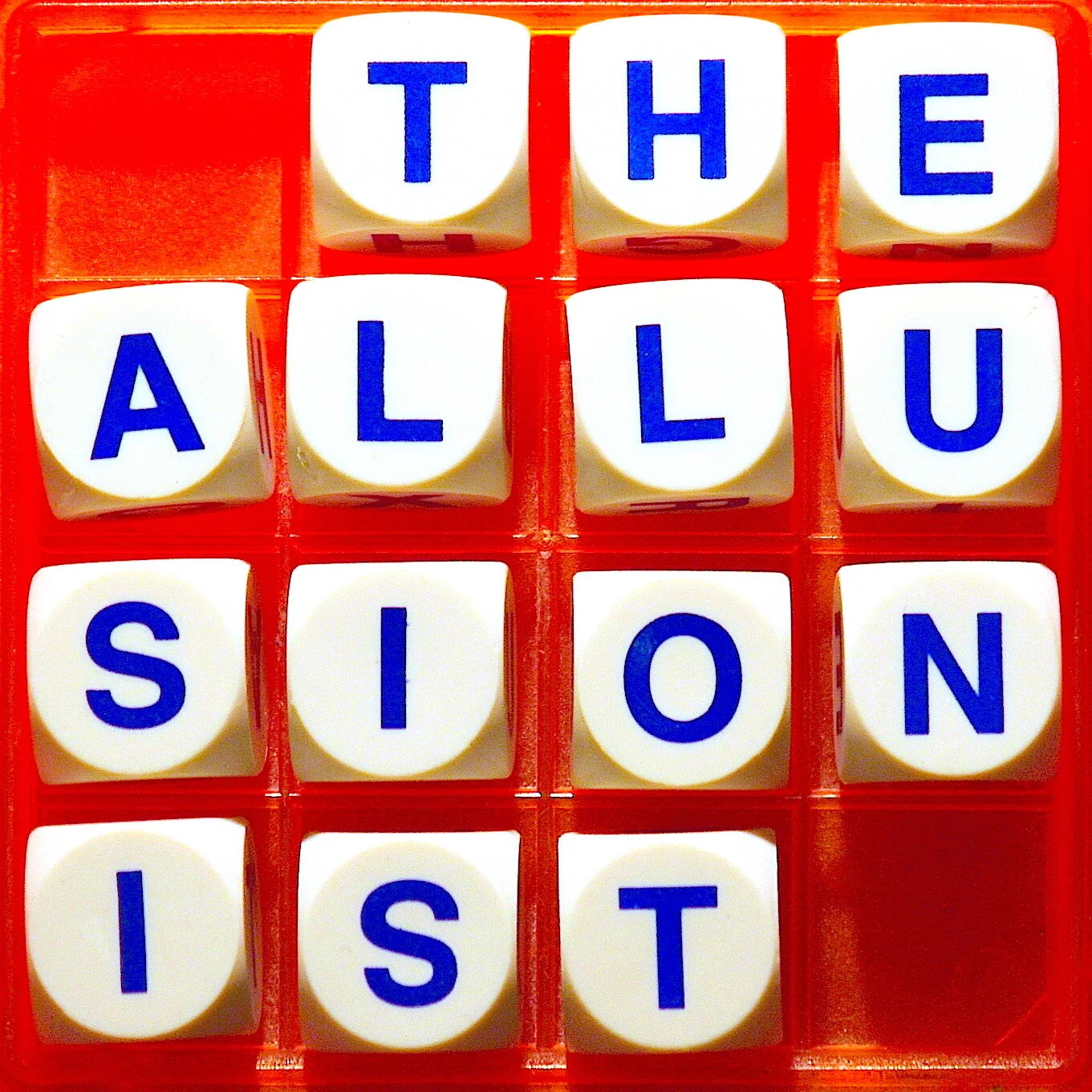
(From top to bottom) Dead Club is a podcast from the band Tunng and is styled on a sew-on band badge, Luminary's The Midnight Miracle is styled on a vintage vinyl sleeve, complete with frayed edges (they even pressed an episode onto vinyl) and a simple but eye-catching example from the brilliant The Allusionist podcast
Get in touch to find out how we can help you develop your next podcast!
Sign up to our newsletter
Sign up to read about the thinking behind the shows – strategy, trends and the odd strong opinion, straight to your inbox.